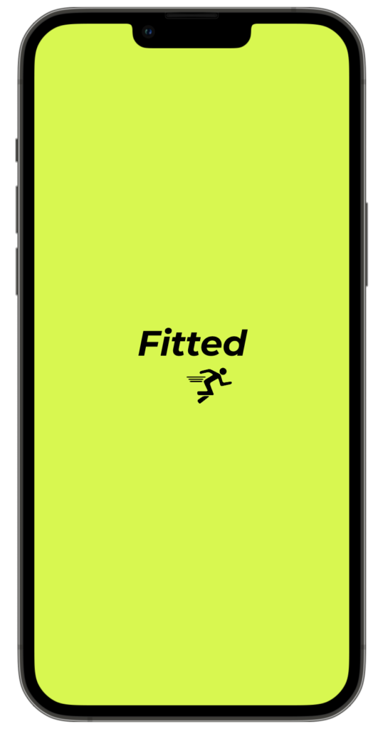
Fitted
Fitted is a web app for users to keep track of their fitness goals, motivate them to exercise & stay healthy, as well as providing fitness training & trainers for them to help reach their fitness goals.
This project was chosen with the interest of fitness & exercise. I have an understanding of what people are looking for & what kind of eye they have when it comes to a fitness app & using one. I know that not so many of the fitness apps are usually very modern & clean looking & some of them aren’t very easy to use either, so I want to improve this design.
User Stories & Flows
When gathering user stories & flows, it’s very important. It helps me figure out & understand better what the users’ needs & goals would be for this app. This process also has helped me determine what the layout of the app should be with the design. That will help me begin the process of making wireframes.
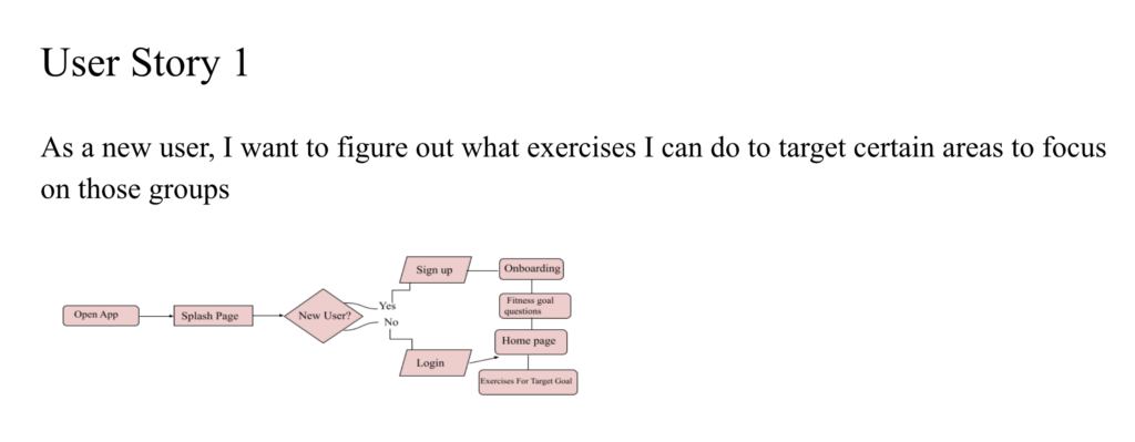
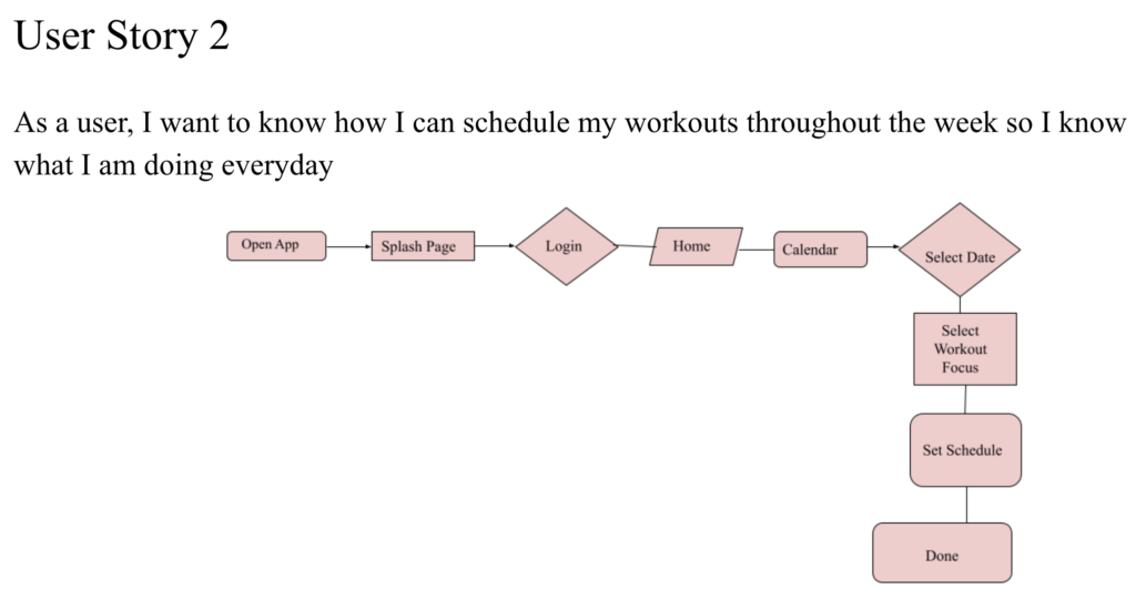
Wireframes
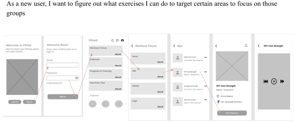
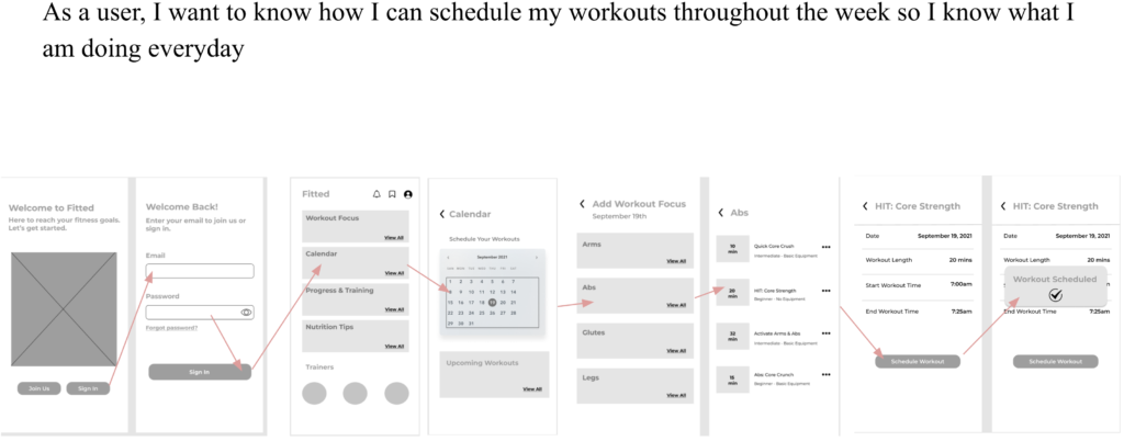
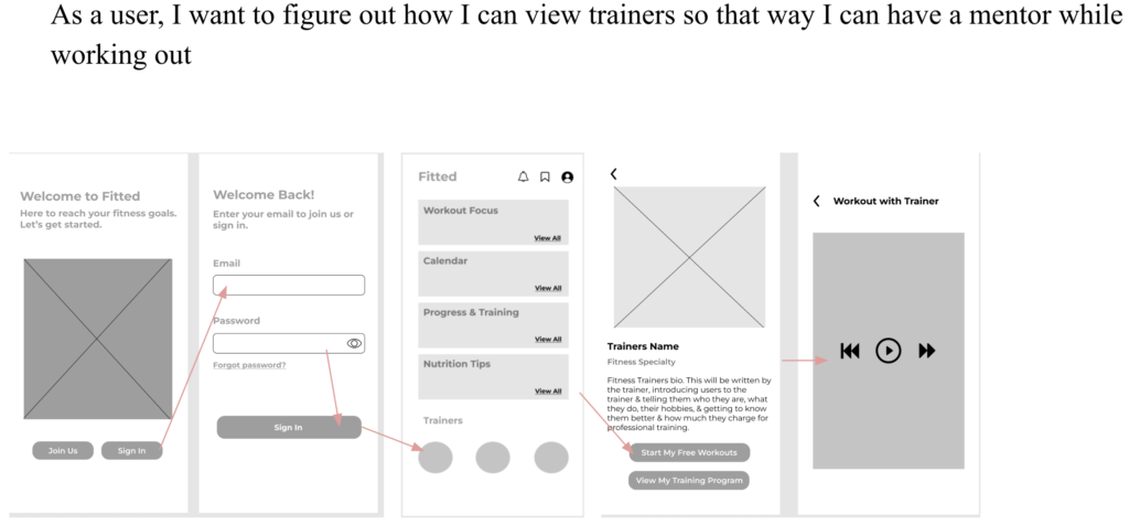
These wireframes are screens of the app that represent the process of each user flow. These wireframes of each user flow are also the layout of the app design displayed.
User Flow 1
User Flow 2
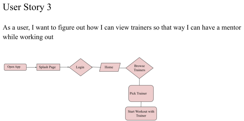
User Flow 3
Mood boards
Before I began the process of creating the high-fidelity wireframes, I created two different mood boards to see what design, style, colors, etc, works best for the app. I wanted to keep the style of the mood consistent, modern, clean, & straightforward.
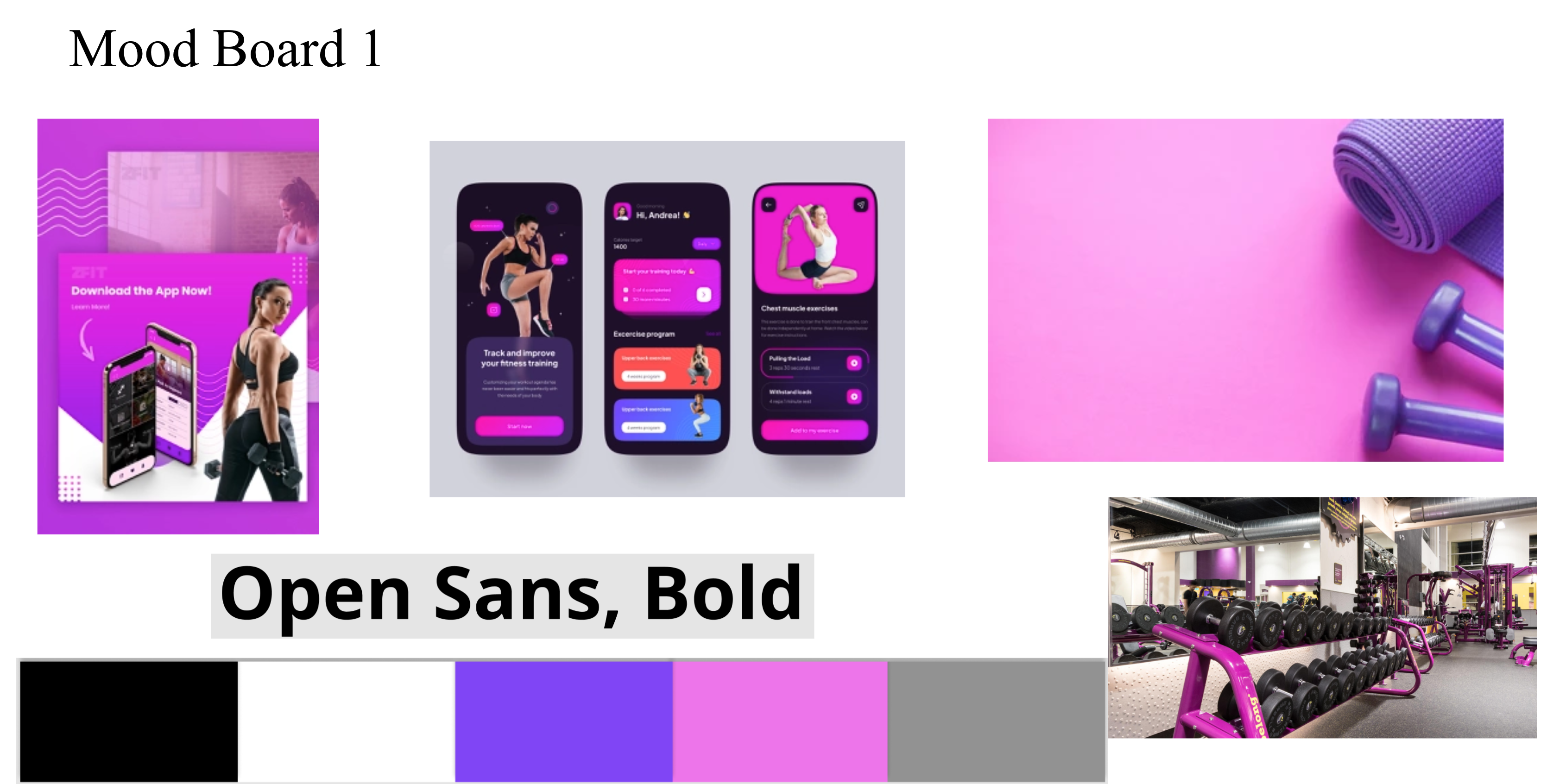
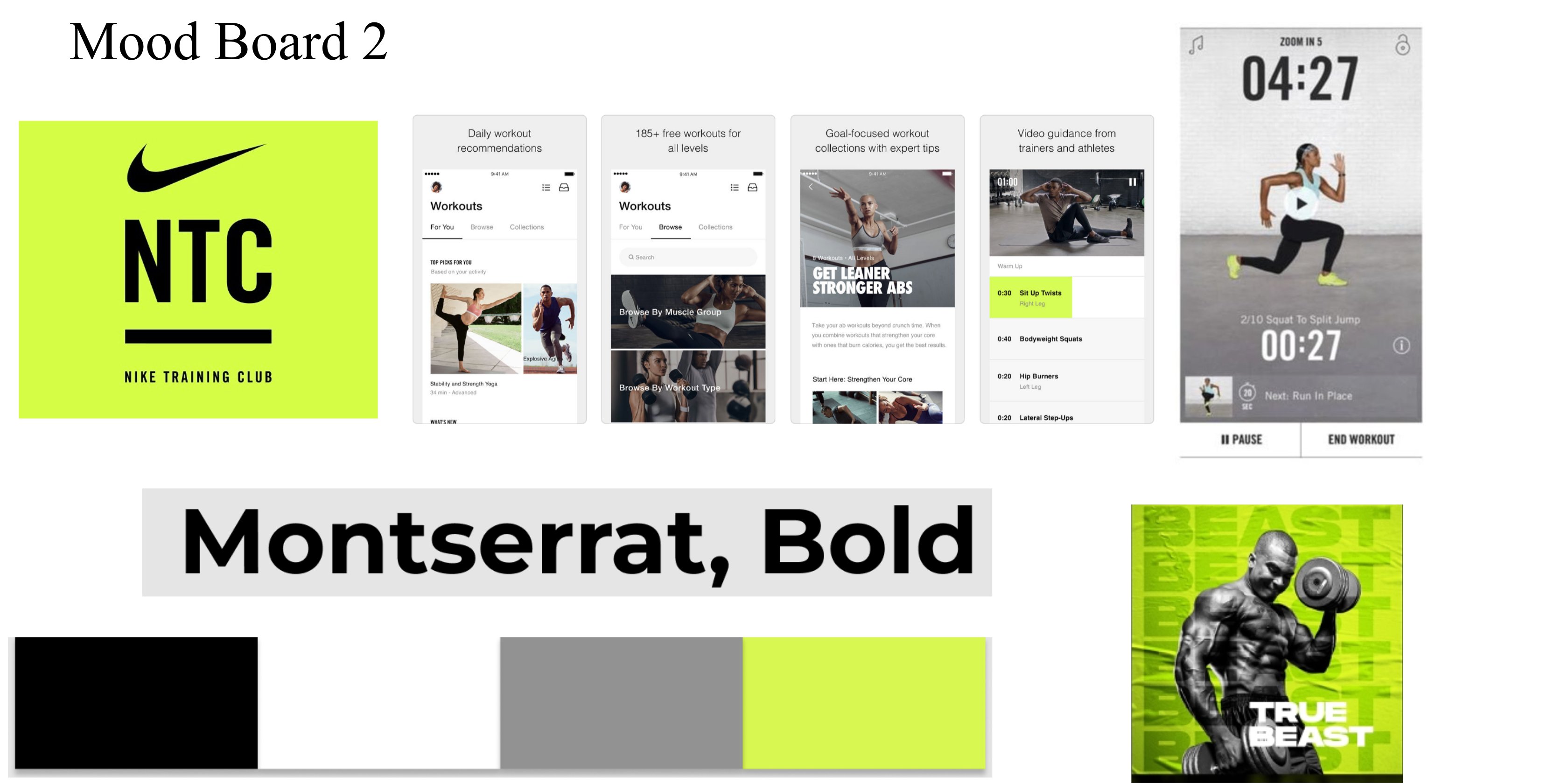
For my selection, I chose mood board 2. I went with this board because I really like the colors, it makes it much more simple & clean, while the green gives it a pop of color. This makes it look easy to navigate as well. It has a very modern clean look than mood board 1 does. I feel like mood board 1 looks like it can be very overwhelming to use, & it also seems like the colors are a bit too much & it looks like there is too much detail that makes it look overwhelming or complicated to use. It also has a very dark hue to it. Mood board 2 is very light, simple, more updated looking & I feel like users will not have a problem navigating the web page like that because it does look & feel more calming than mood board 1. Mood board 2 also keeps the colors way more consistent. The colors are simply, white, black, grey & green. Whereas with mood board 1 the colors can be all sorts of pinks, purples, blacks, with some white, etc, it just isn’t as consistent. Because of the layout idea of mood board 2, & the color selection for it, I feel like it makes the app much more straightforward for users.
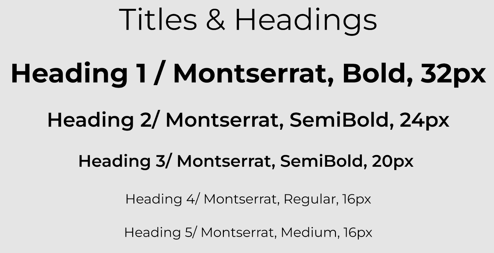
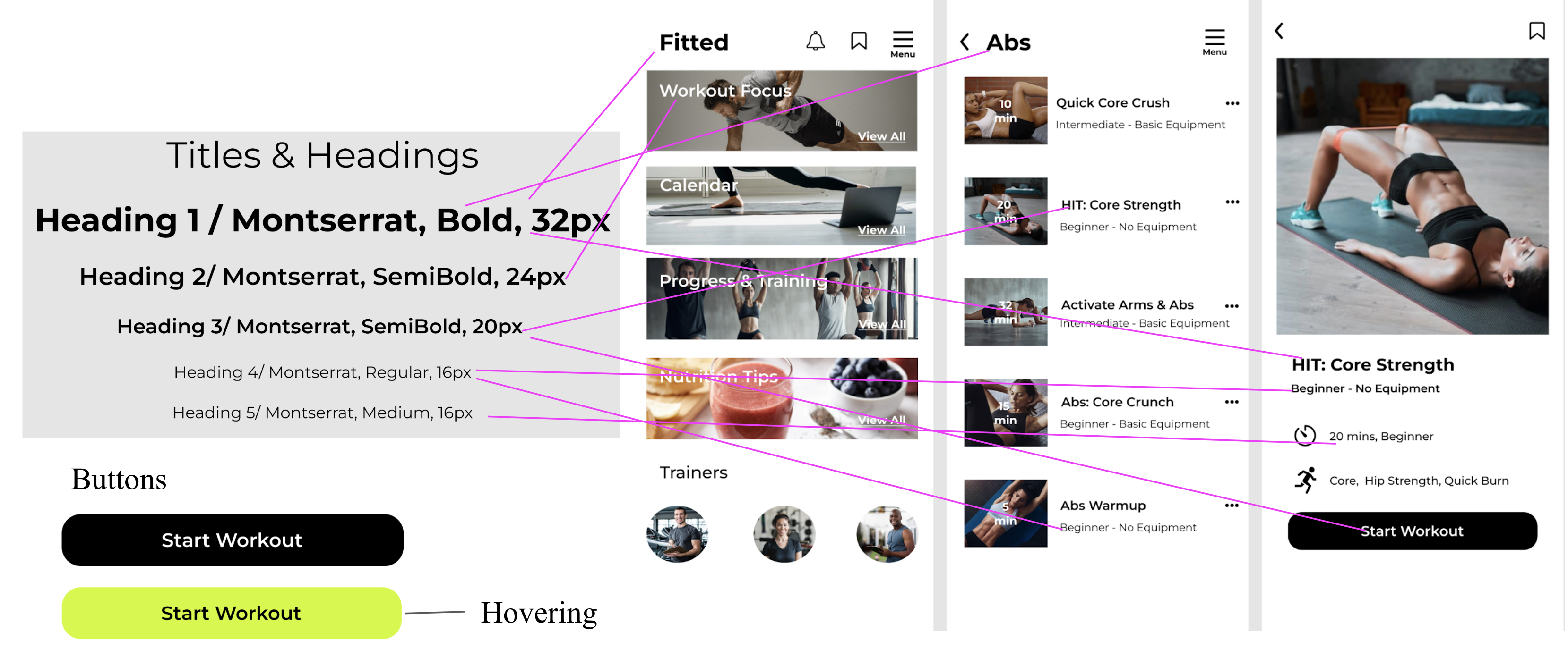
Typography
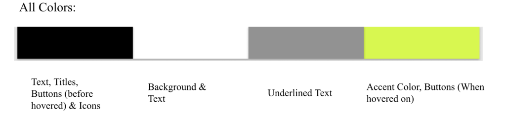
Color Palette
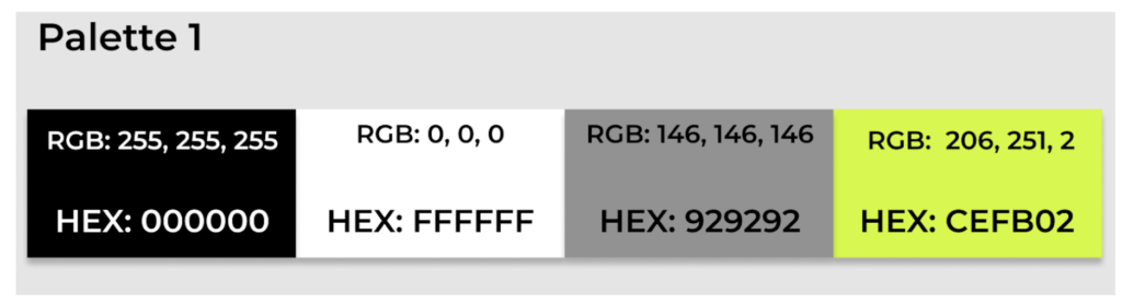
Hex#000000: Black gives it some contrast, which I feel is greatly needed when it comes to designing. Contrast helps enhances usability.
Hex#FFFFFF: White gives the design a very clean look, which is something we aim for with the app.
Hex#929292: This color is not in the wireframes as much, but it does bring a little more contrast as well. But this color could support some input fields, etc.
Hex#CEFB02: The green color on the palette sets an energetic kind of tone to me which fits well for the concept of the app. I love how this could be the pop of color. It really stands out from the other colors.
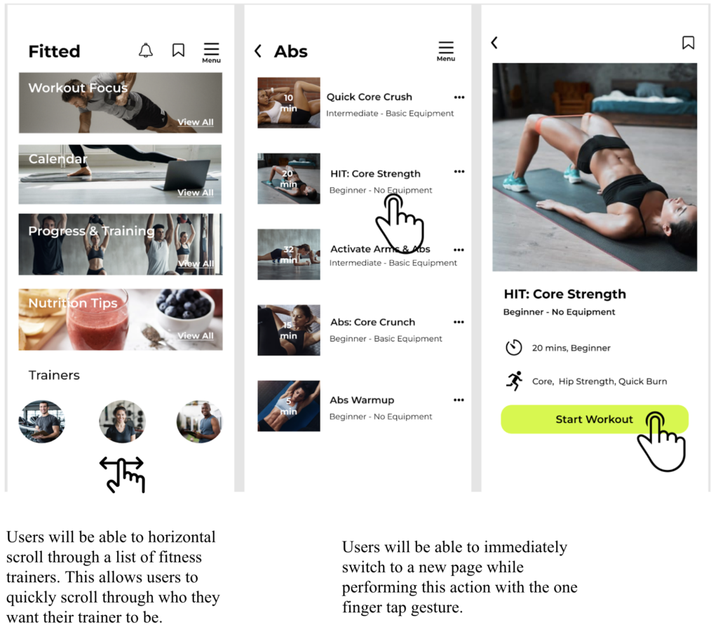
Gestures
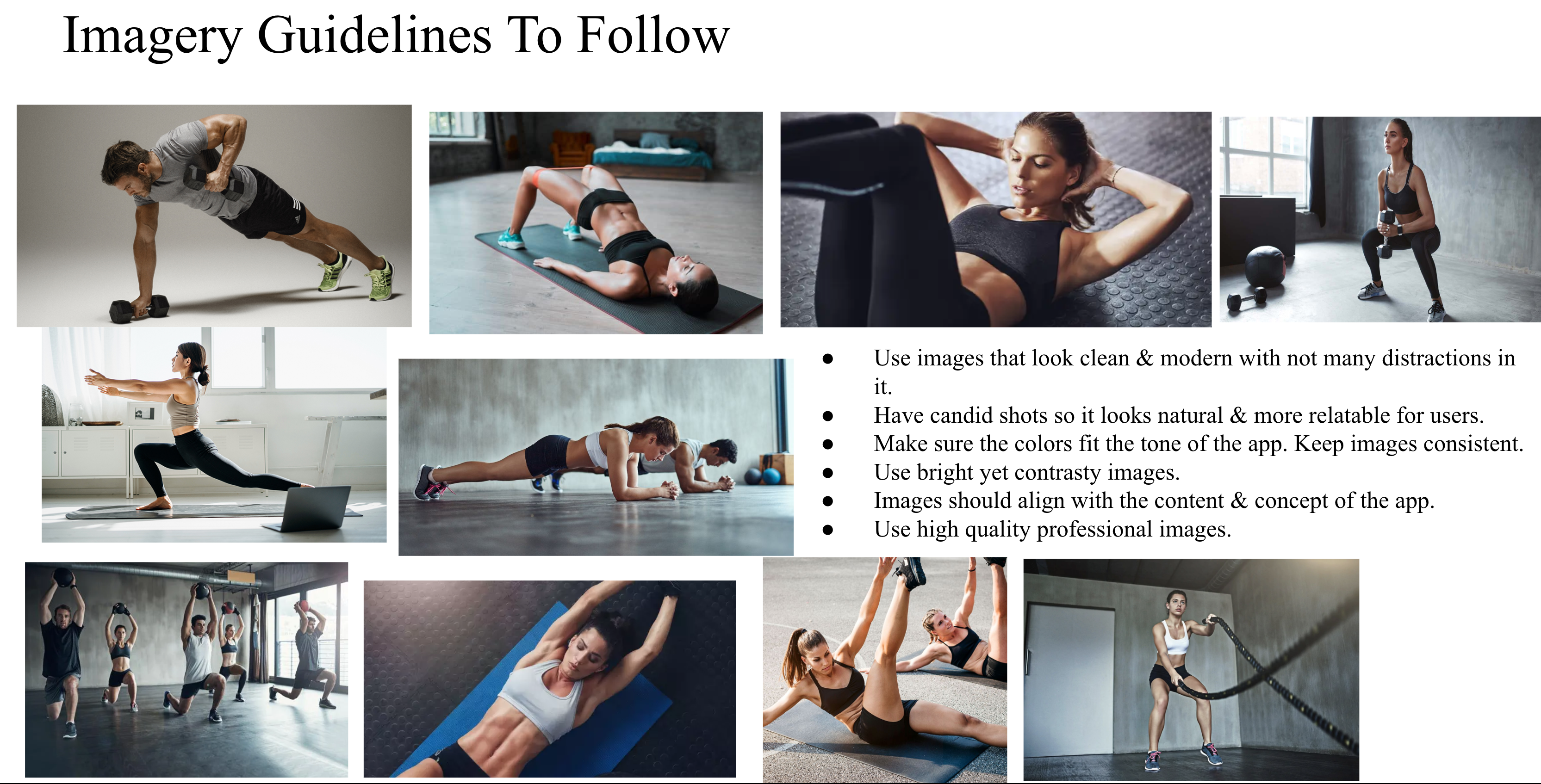
Imagery
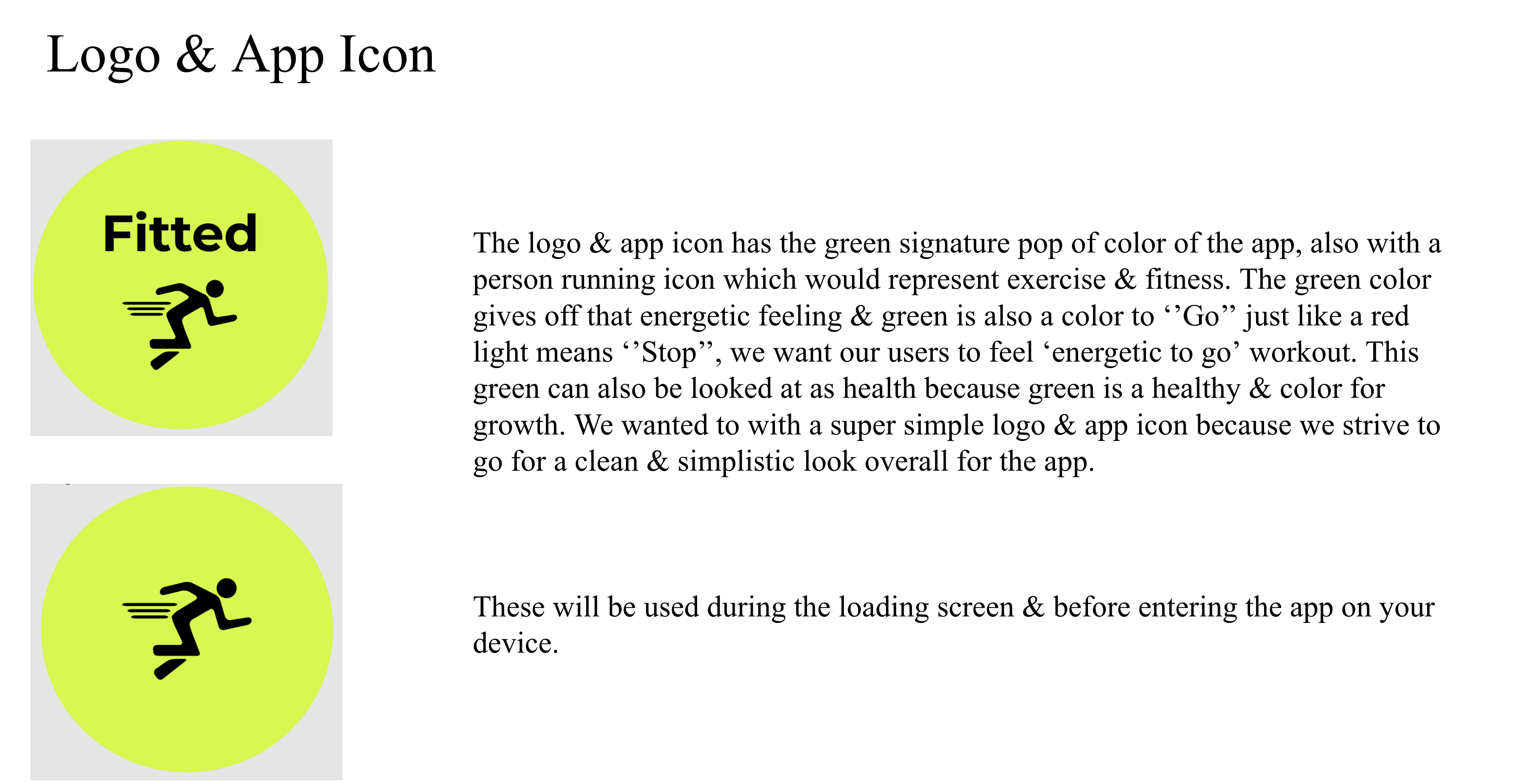
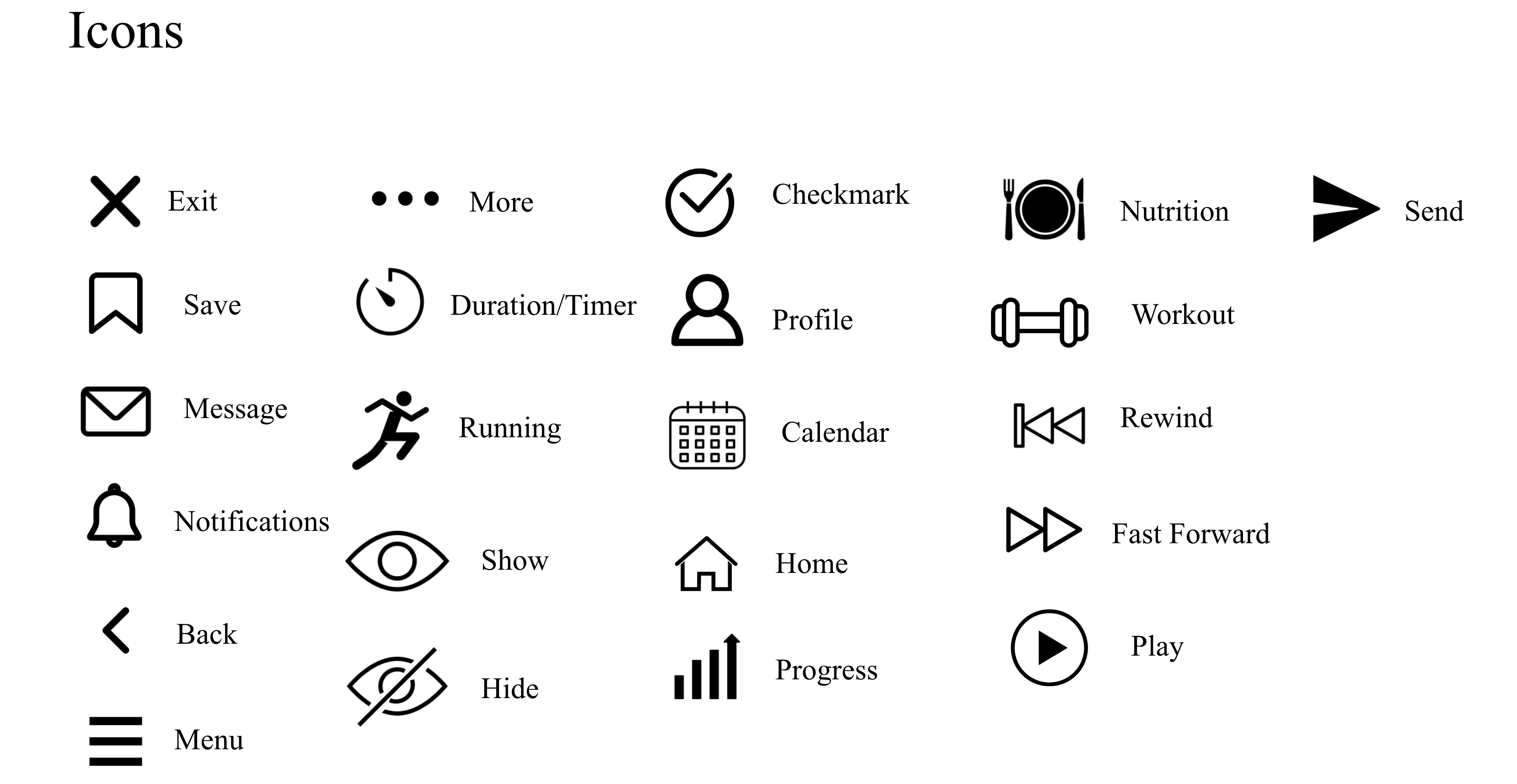
Logo & Icons
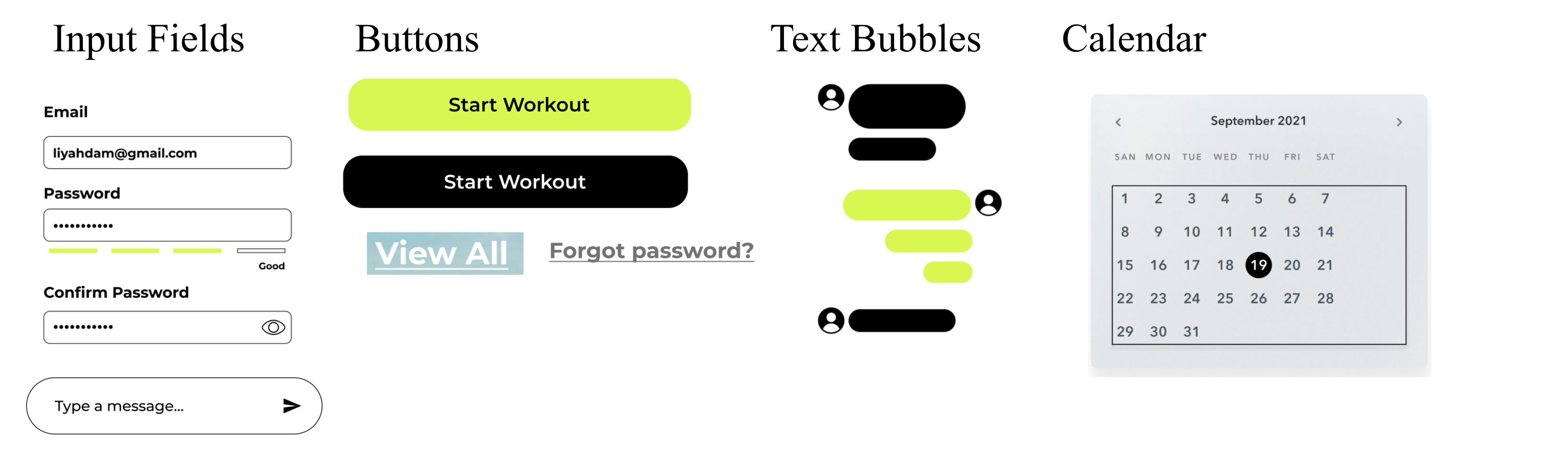
UI Elements
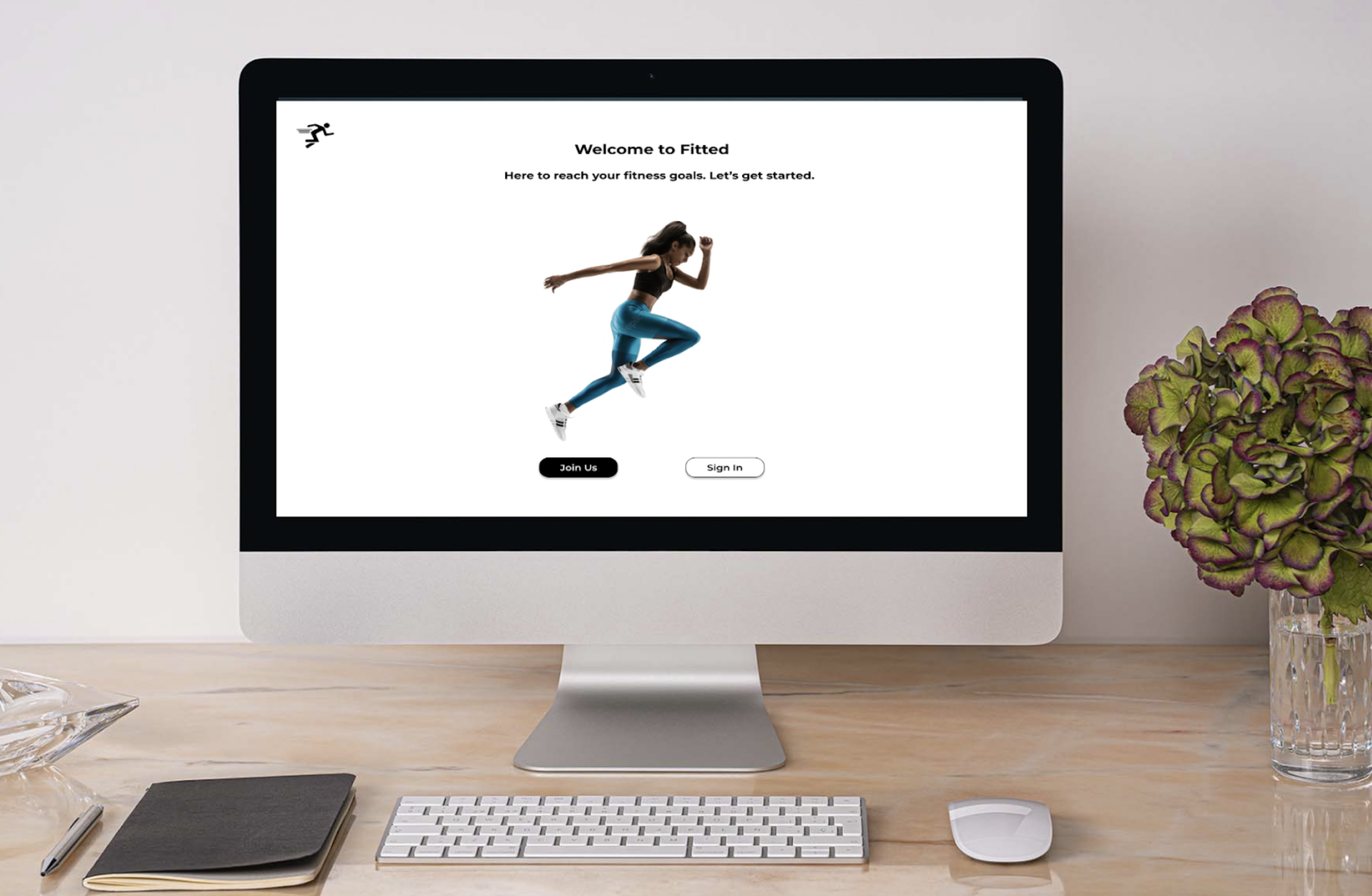
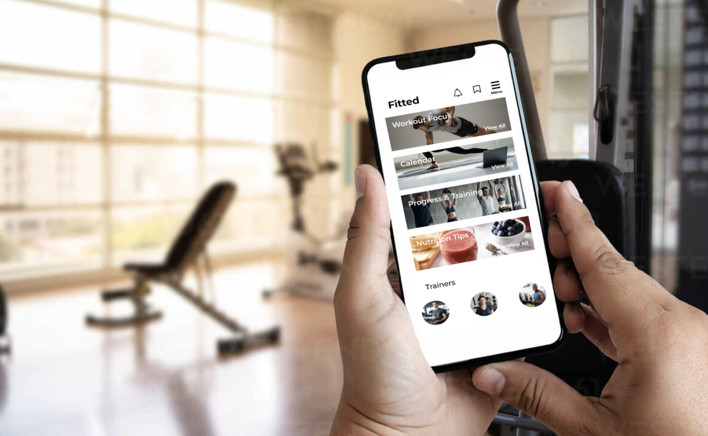
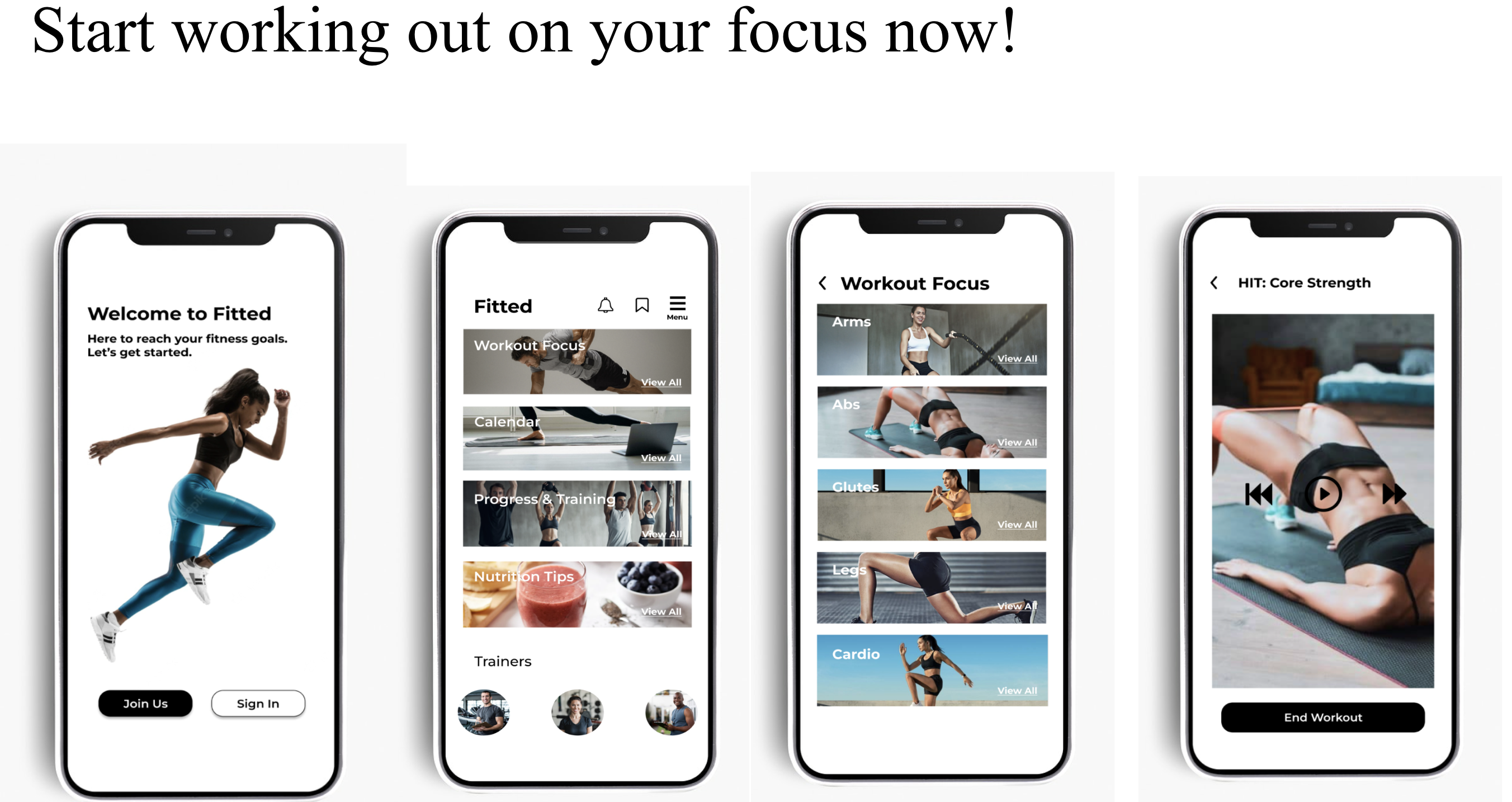
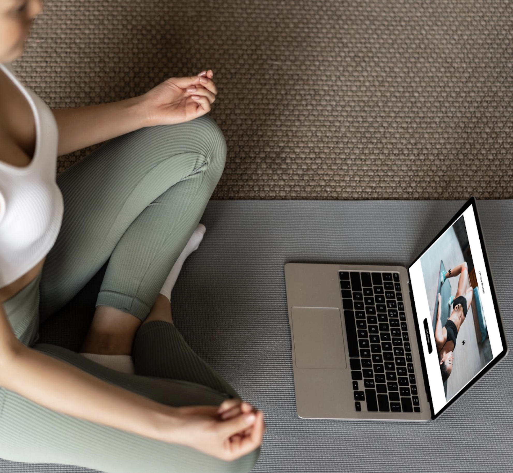
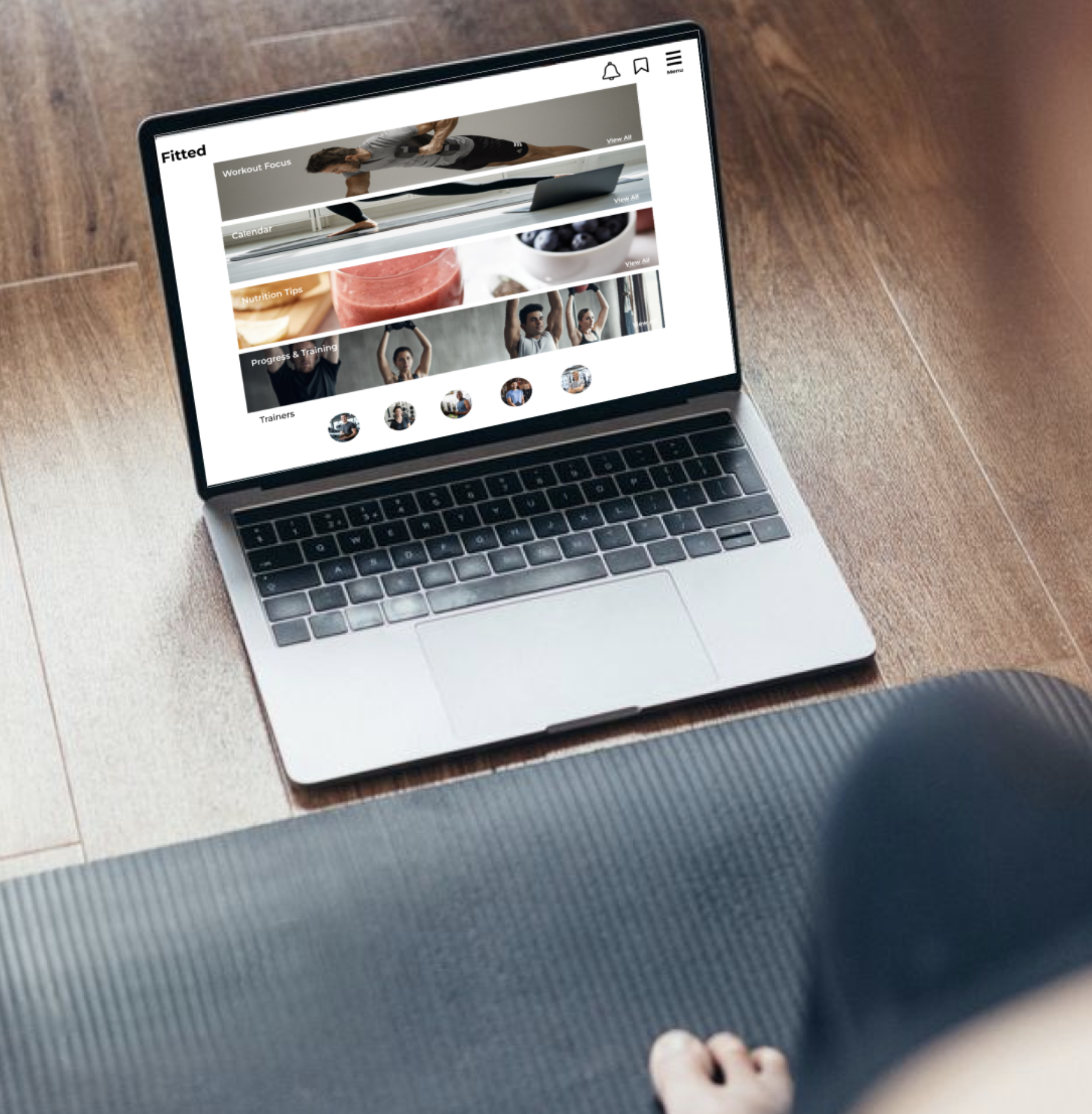
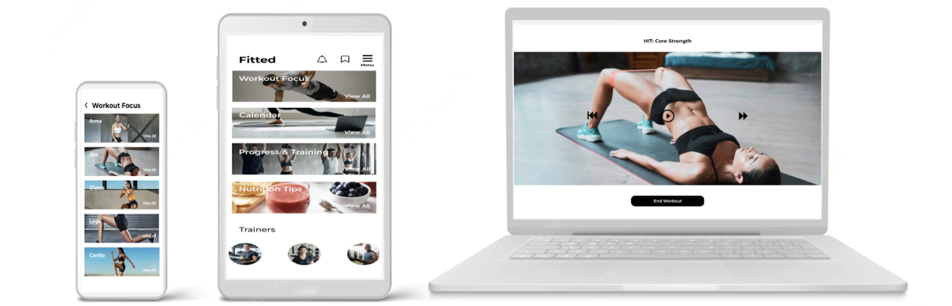
Final Mockups
Designing for Fitted was a great experience I really got to understand UI a lot better. I also learned a lot & it made me very proud to see that this is my very first UI project, this is just the beginning. I researched a lot for this, & had a lot of inspiration behind doing this project. I enjoyed the whole process of designing the layout & making this look aesthetically & visually appealing, I think that’s the fun part & getting to see the final product. I believe that the only difficult part of this project was probably just looking for the best images to use on this app. It can be difficult to find images that would align with the brand, but that takes time. After doing the final mockups, I present to you the final product with the final prototype & animation.