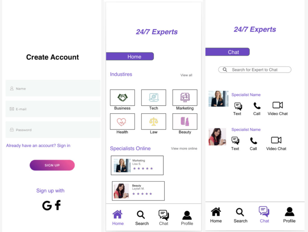
24/7 Experts
24/7 Experts is an app for users that have a question that they may not be able to find the answer to & would like to get the accurate information on & accurate answer by a specialist virtually. This app has features from where you can search up questions & answers that have been asked by other users & answered by experts. It has a feature where you can search up a specialist online in any industry that you can ask a question, & a feature where you can chat with experts.
Note: this project is more focused on the UX than the UI.
Our users will need a user friendly experience that will hold a purpose. Users need an app that they can use whenever they have a question or need an answer to something as soon as possible, whenever & wherever they are, no matter the field. Having answers from experts be relevant, true, & helpful because users are not able to either look up answers, do research, or are able to reach people from certain industries & various of fields, as well as wanting or needing to know the answer to something now. Will we need to have this Expert app provide accurate responses & answers from our experts on the app from any field you can think of that will be answered right then & there for users if needed. With experts that are either certified, licensed, or have a degree. The app will have a simple & clean interface making it easy for user to access.
User Research
Research Goals:
I want to know if the potential users like the purpose & idea of the app, what features would users find helpful or would like in regards of the app & how this app can be beneficial for users based on their wants, needs & goals.
Affinity Map:
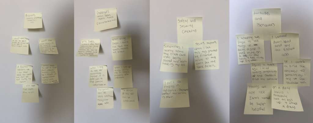
Insights:
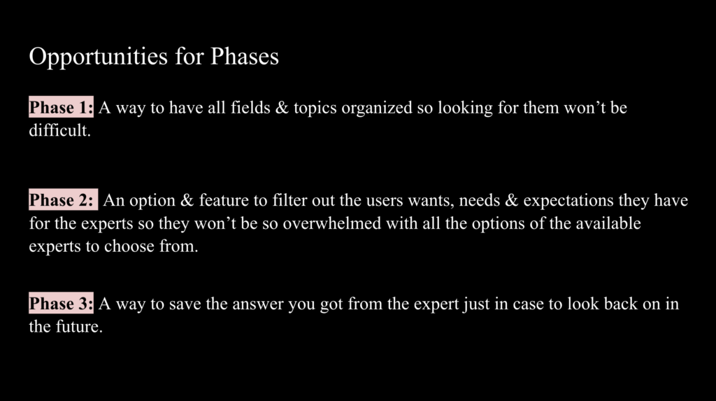
– Users want the app to filter down the question(s) they have so it would know what users are talking about & what they mean & have it narrow down the topics.
– Users want the app to have answers that are relevant to the question being asked.
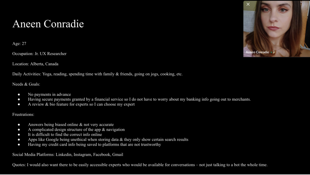
– Users don’t want to pay experts in advance.
– Have secure payment by having a tag with granted by financial service so merchants don’t have the users banking info.
– Users do not want answers to biased but to be accurate.
– Users want a simple & easy navigation & design of the app.
– Users want a review & bio feature for the experts so they can pick out what expert they want.
– Users want topics to be organized so searching things will be easier.
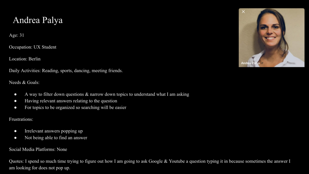
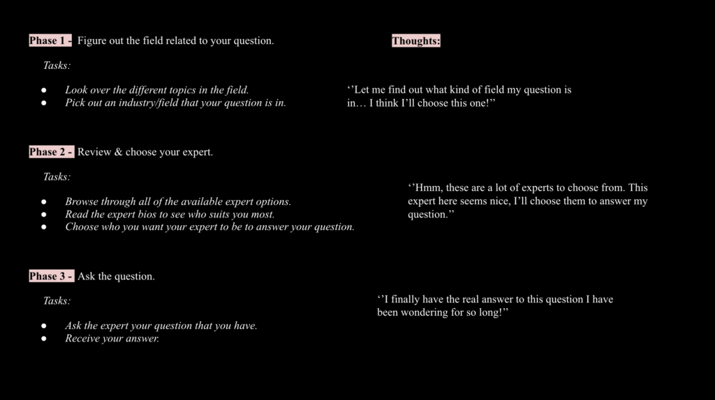
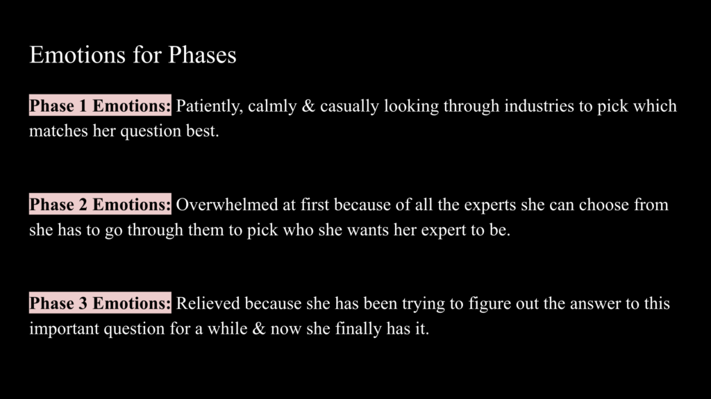
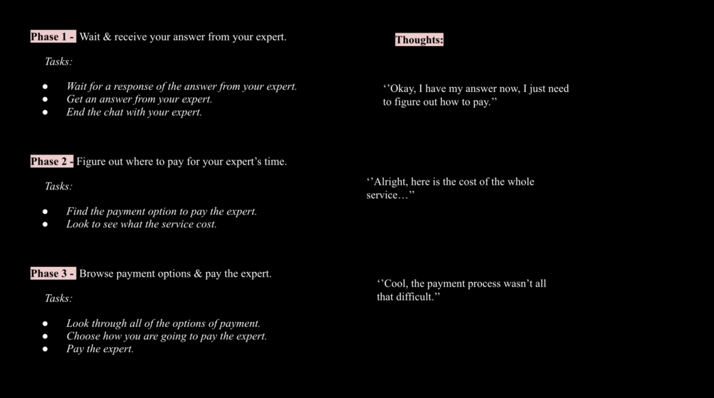
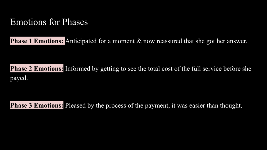
User Personas & Journeys
After my User Research, I then create user personas to help me understand from a users point of view so this will give me an idea of the users that I will be designing for. User personas & journeys help me understand users better so that way I can make this app have the best experience. So with all of this information & data I collected, this helped me figure out how the navigation & design should be set up.
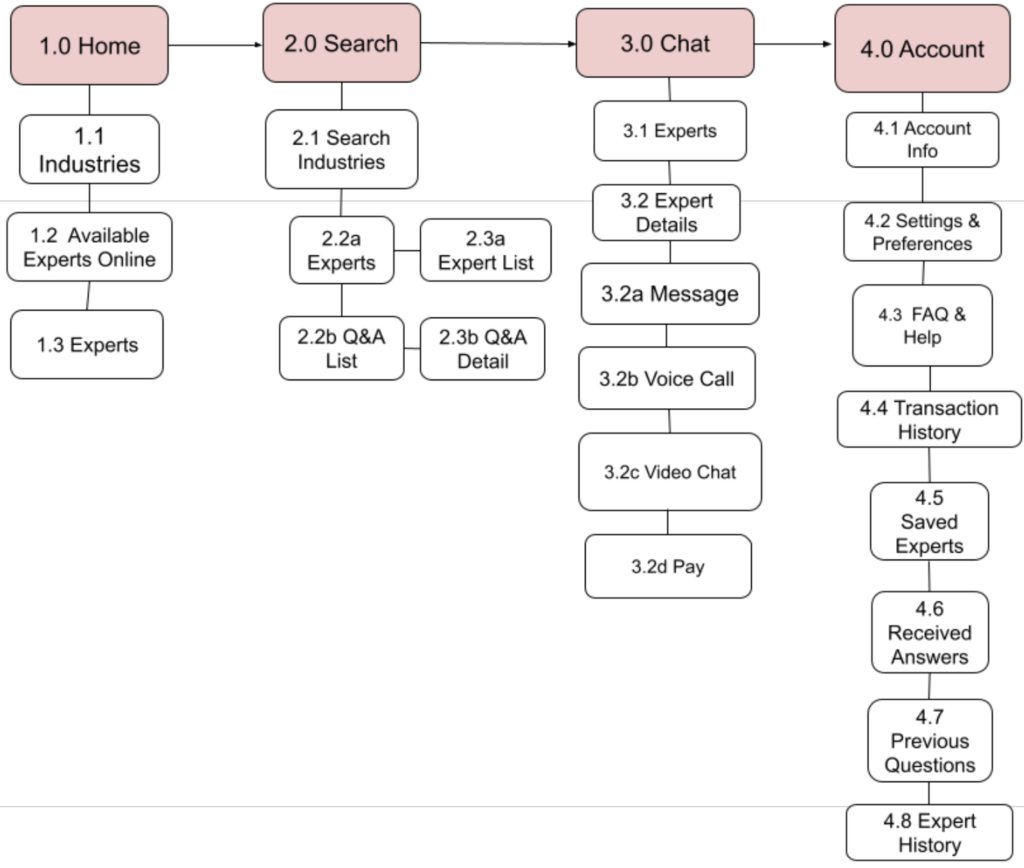
Navigation Sitemap
After gathering all the information & data based on the user personas, this then leads me to creating my sitemap to figuring out the navigation of the app. The navigation is very important because this will determine how everything will function & how all of it flows. Before setting up the sitemap, I conducted a card sort of 4 categories with 19 cards to see how most users would think as to where every feature would be on the menu navigation, figuring out where they would each belong.
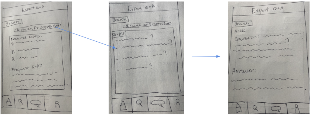
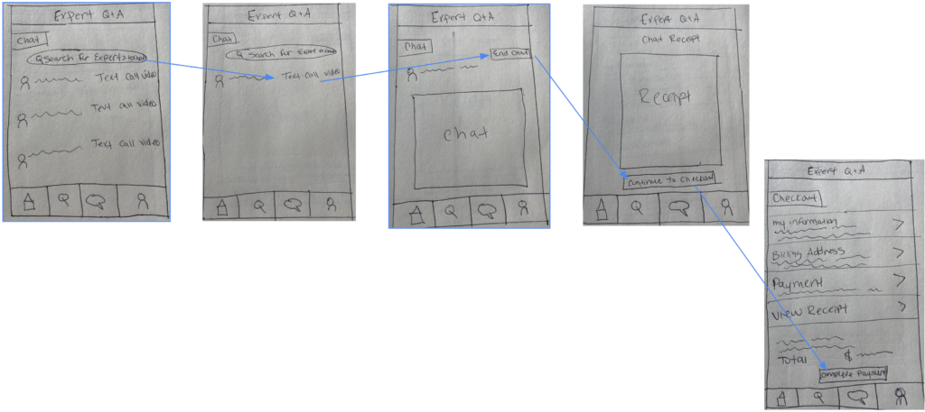
Low Fidelity Paper & Sketches
After developing the sitemap, this is when I begin to figure out the layout of the app by drawing wireframes. Sketching out the design layout helped me get an idea of how I could see the design of the app. I knew all of the sketches would only be the first rough draft of the layout, because there is so much that can be done digitally as I start designing. Also, more and better ideas come with time throughout this whole designing process.

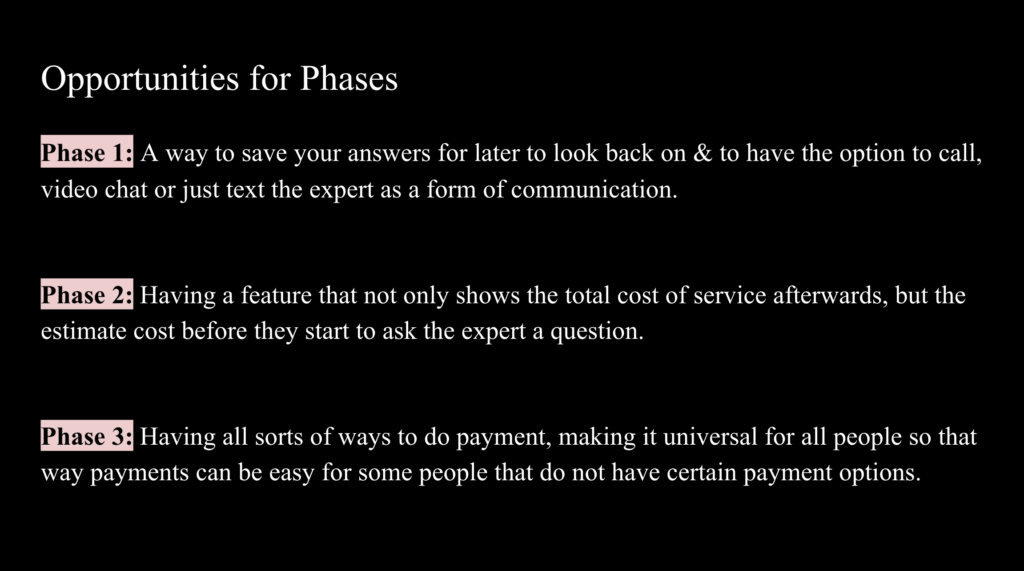
Mid-Fidelity Prototype
After doing the sketches as my vert first rough draft, I created the flow on Balsamiq, now there is a better visual of the design. I have created 3 of the main features of the app into mid-fidelity prototypes translated from my low-fidelity prototypes. Then I may begin testing the design with users then refine the design with its main features.
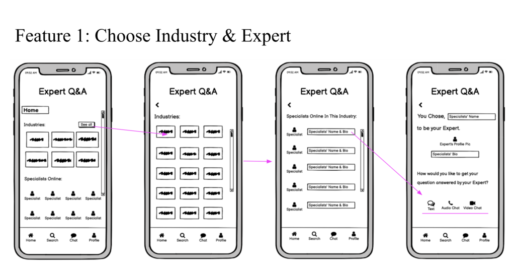
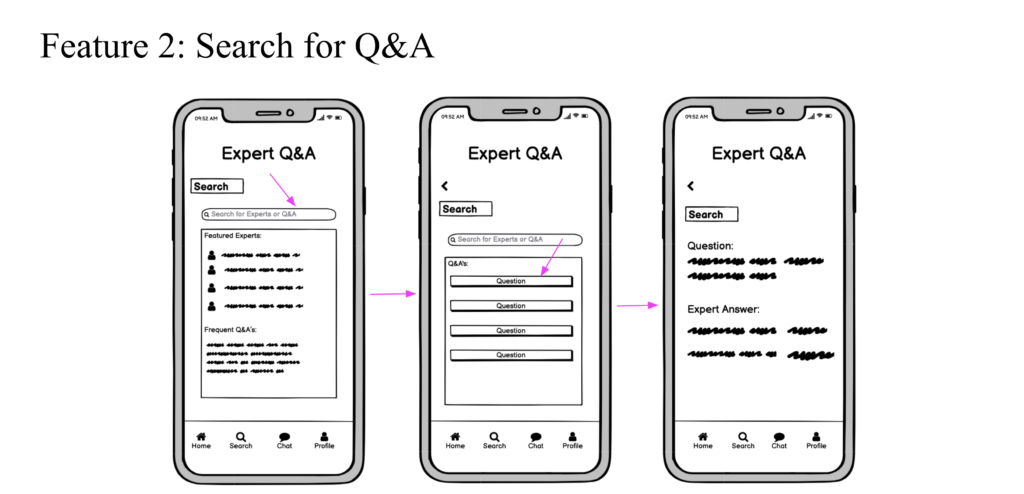
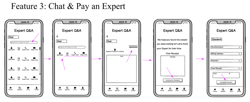
My main features are:
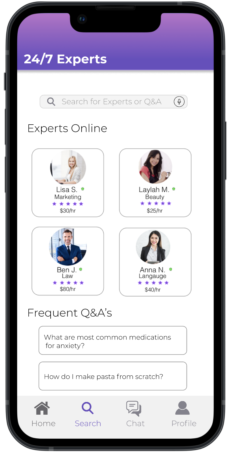
- Choose an Industry & Expert
- Search for Q&A
- Chat & Pay an Expert
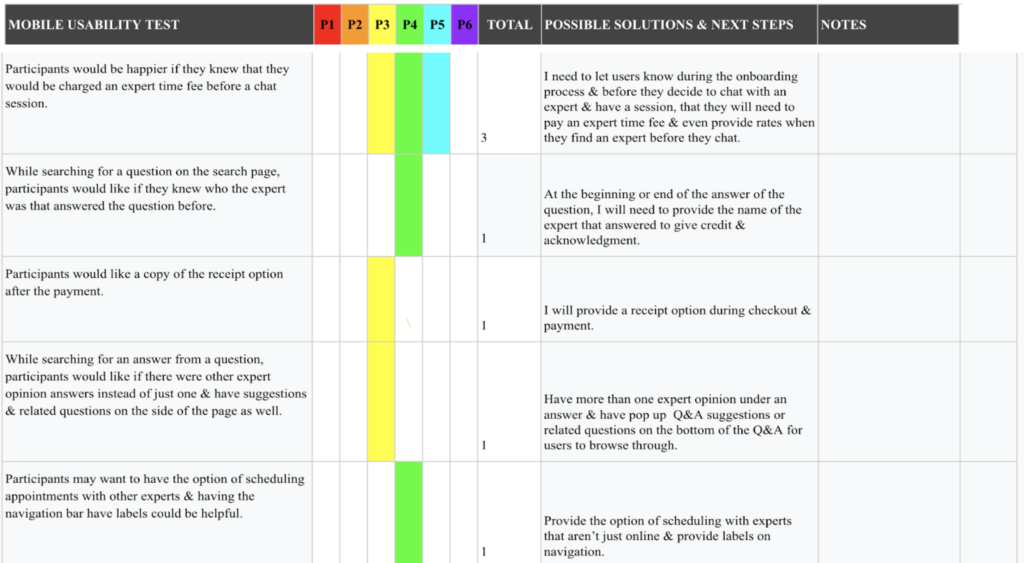
Usability Testing
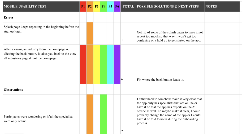
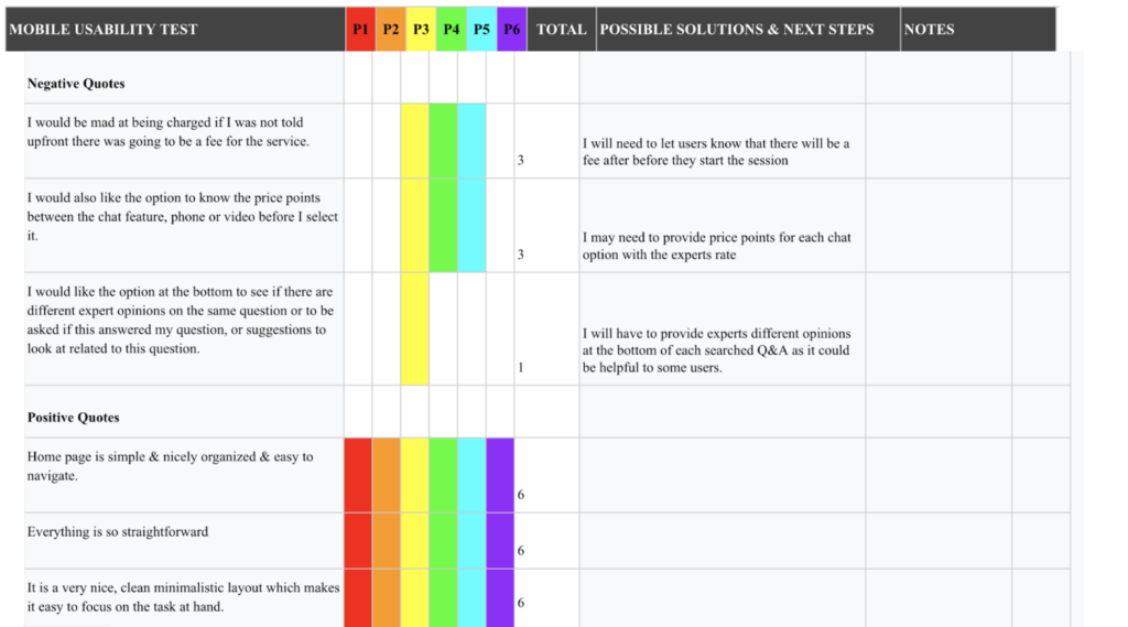
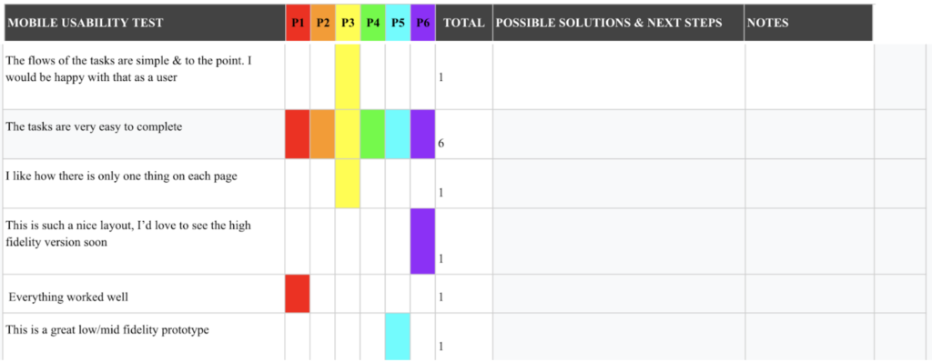
Six usability tests were conducted. Each session was held for about 10-15 minutes & had a usability test plan & script. These sessions were done remotely moderated. To test the prototype, the prototype the shared from Figma. All of these tests were done on a mobile device. Participants doing a remotely moderated test will share their screen via Zoom. Each session is recorded. After conducting all the usability tests, I have received a lot of feedback & input so far on the design. All of this information from the participants that I have received has better helped me understand what it takes for me to improve on this app for users. A lot of the users found the navigation & layout very simple & easy to use. Although, there were a few errors, complications & things that needed to be resolved, I have found the solution to them already. Usability testing really helped me figure out more of the needs & goals of potential users.
With the previous mid-fidelity as seen before in grey-scale, I made some revisions to it for users to interact with the prototype for the usability testing. People are more visual so colors & images can make people feel a certain way so I wanted to incorporate some color in the app as they tested the mid-fidelity prototype. Adding color & images also helps me figure out what colors I think would fit best for the app & helps me figure out what layout idea would be best as well.
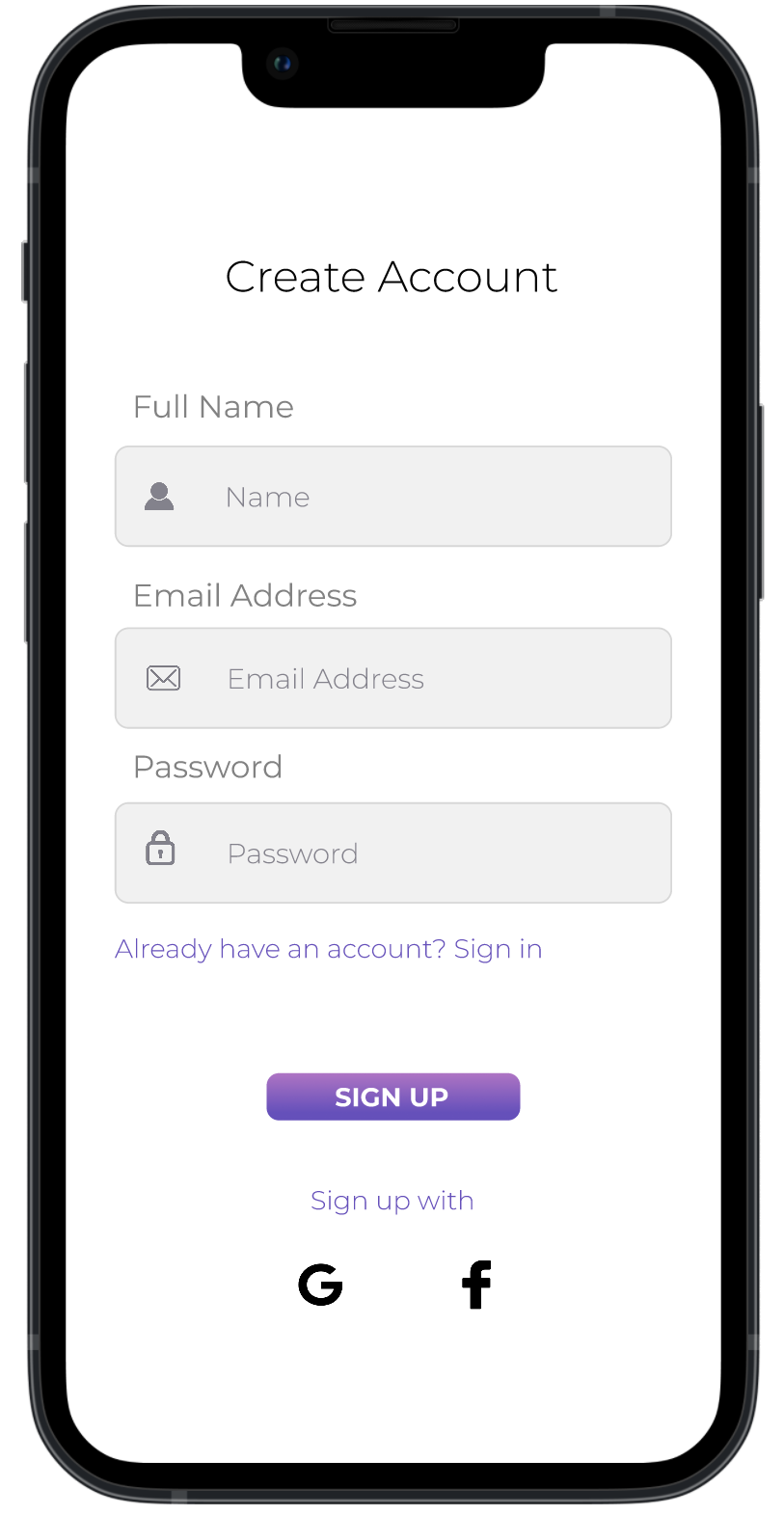
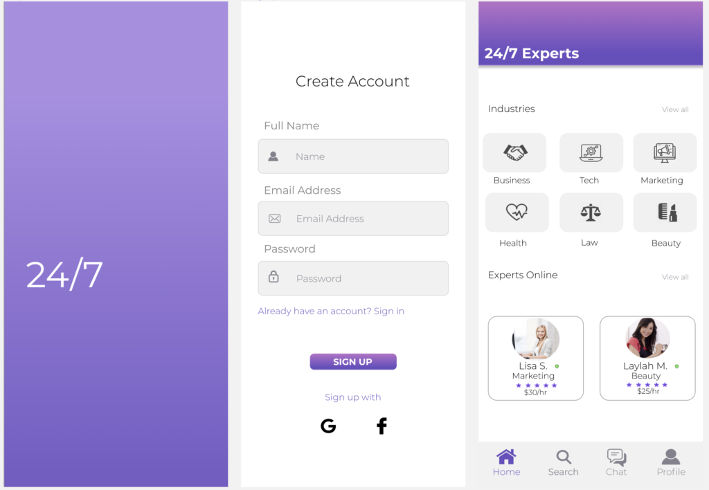
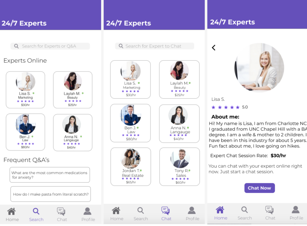
High-Fidelity Prototype
24/7 Expert’s greyscale prototype helped me get the idea of the flow for the app’s navigation, as well as giving me an idea of what the potential wants & needs would be for users. With the higher-fidelity iteration, I cleaned the design up a lot more & made it look more simple & modern. After the usability testing & coming up with solutions for the issues the users had with the design, I then moved onto creating the high-fidelity wireframes so that way I can do a little more testing on it before I begin the next few steps for the final design. After the final testing I will then work on making sure that the app has great accessibility & readability for all.
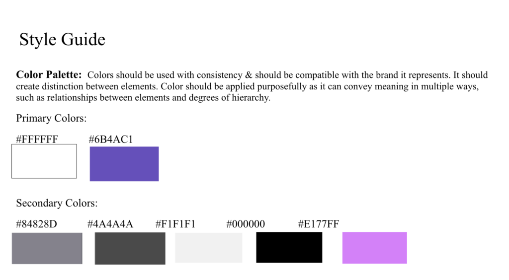
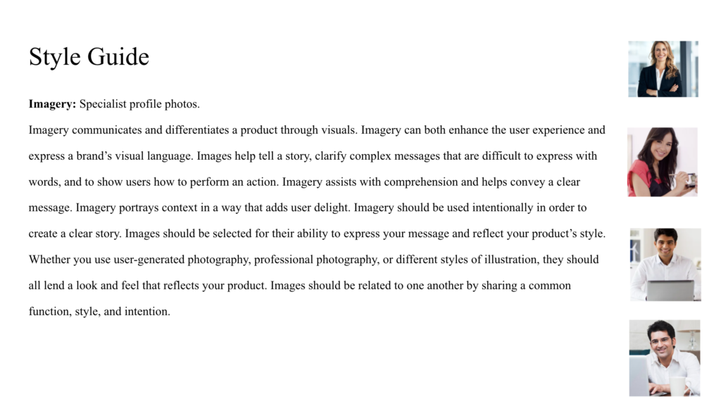
Refining The Design – Style Guide
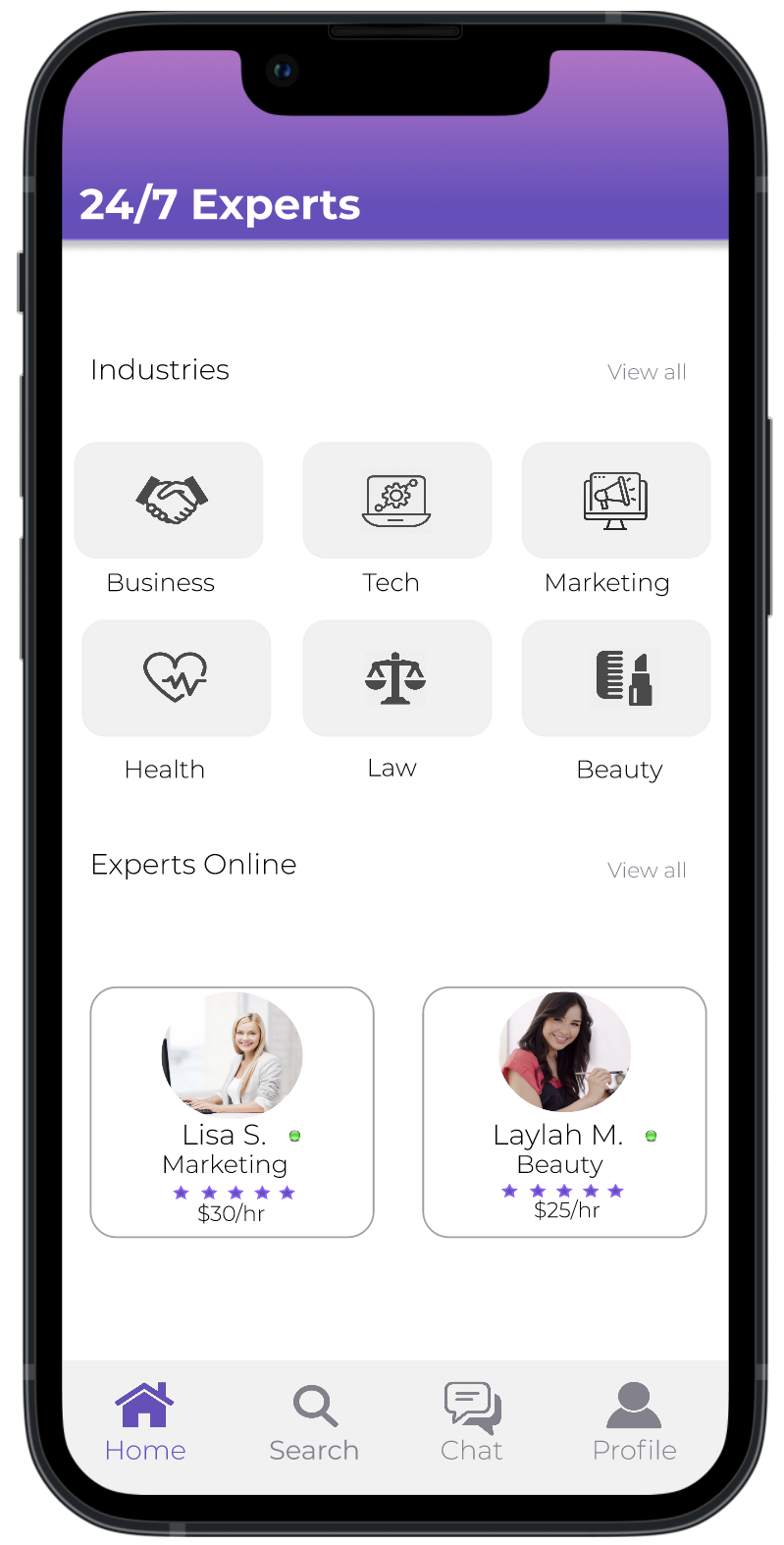
With every iteration, came me getting happier with the visual aesthetic of the design. I decided to go to with a simple color palette with a pop of color. With the pop of color that I chose, I made that the main color for the overall app. For example having the navigation menu be in purple if a user is on that page, or having buttons be purple as well.
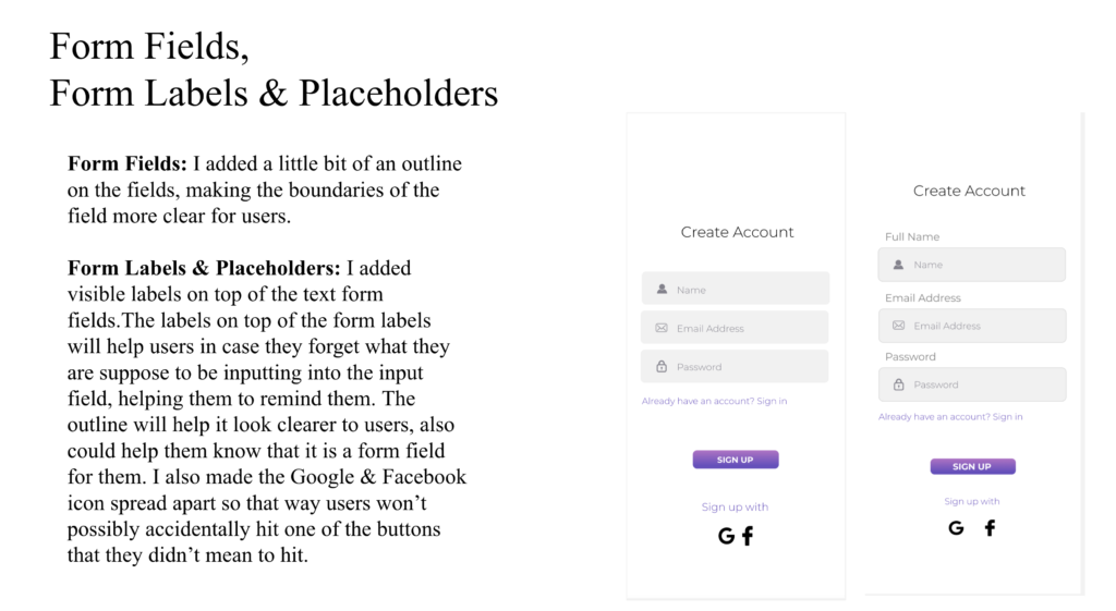
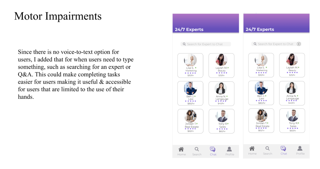
I also designed for accessibility. With the design regarding accessibility, includes contrast between text & background, I made form fields, labels & placeholders accessible for users, & also designed accessibility for users with motor impairments.
There is a contrast with colors & the background making it easily visible for users to go through with using the app. Such as the colors of the contained buttons being purple. Using a good text size for users to read & having the contrast of the font color from the background so users can see.
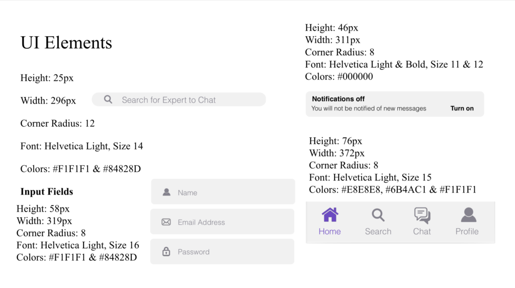
UI elements are the main building blocks for all applications. They are responsible for interactions between the user and the application. They are what allows for effective user navigation and input/output data, to name but just two core functionalities.

Final Product
For this high fidelity design iteration, we went through one last test to gather feedback from other designers. After collecting all the feedback, I went up & cleaned up & finalized every screen of the app & created this as the final prototype.